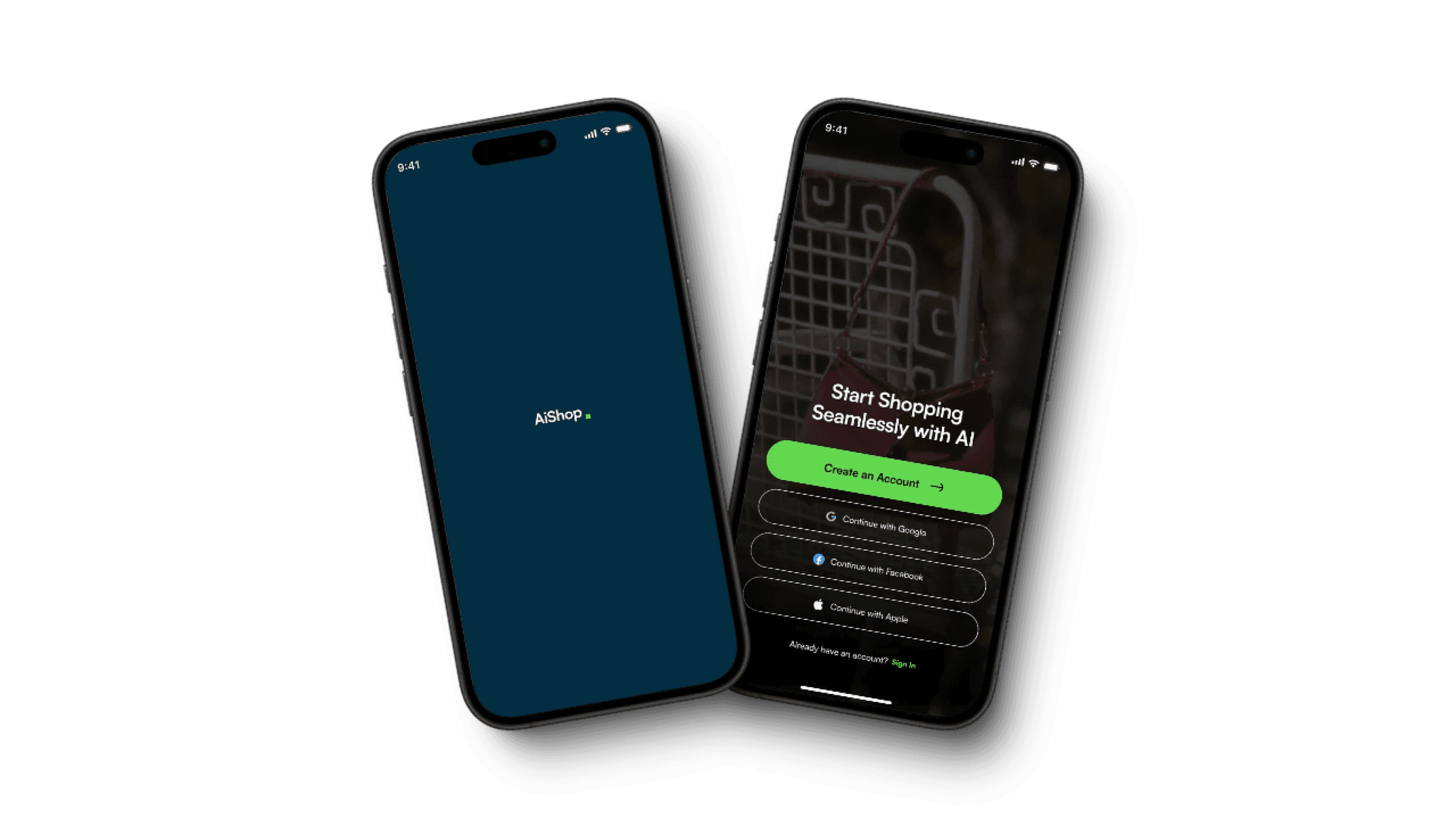
Ai Social Shop
Revolutionizing E-commerce: A Human-Centric Approach with AI Assistance
The Product
Most shopping apps get deleted after the first use. I designed one people actually wanted to keep.
I was approached to design a new kind of shopping app not just another marketplace, but something different. Something meaningful in an already crowded online shopping space.
The Problem
Most shopping apps work but they don’t connect. And that’s the real problem.
They’re:
Visible (thanks to ads)
Convenient (thanks to logistics)
Familiar (thanks to repetition)
But after the first order, they get deleted. Why? Because they’re forgettable, rigid, and often ignore the very culture and behavior that drive shopping in the first place.
I set out to design something different — an app built on real habits, everyday friction, and emotional triggers that influence how people actually shop.
The Goal
I didn’t want to build an app that shouted louder than the rest.
The goal was to create a product that users remembered not because of ads or promotions, but because it felt intuitive, fit seamlessly into their habits, and delivered small but powerful moments of control, satisfaction, and trust.
Instead of fighting for attention, I focused on earning it.
My Role
I led the entire design process, strategy, research, ideation, UX, UI, testing, and refinement.
UX research
User interviews & analysis
Problem framing
Wireframing
Visual design
Usability testing
Iteration
Stage 1
Understanding the User
User research
Problem & Hypothesis Statements
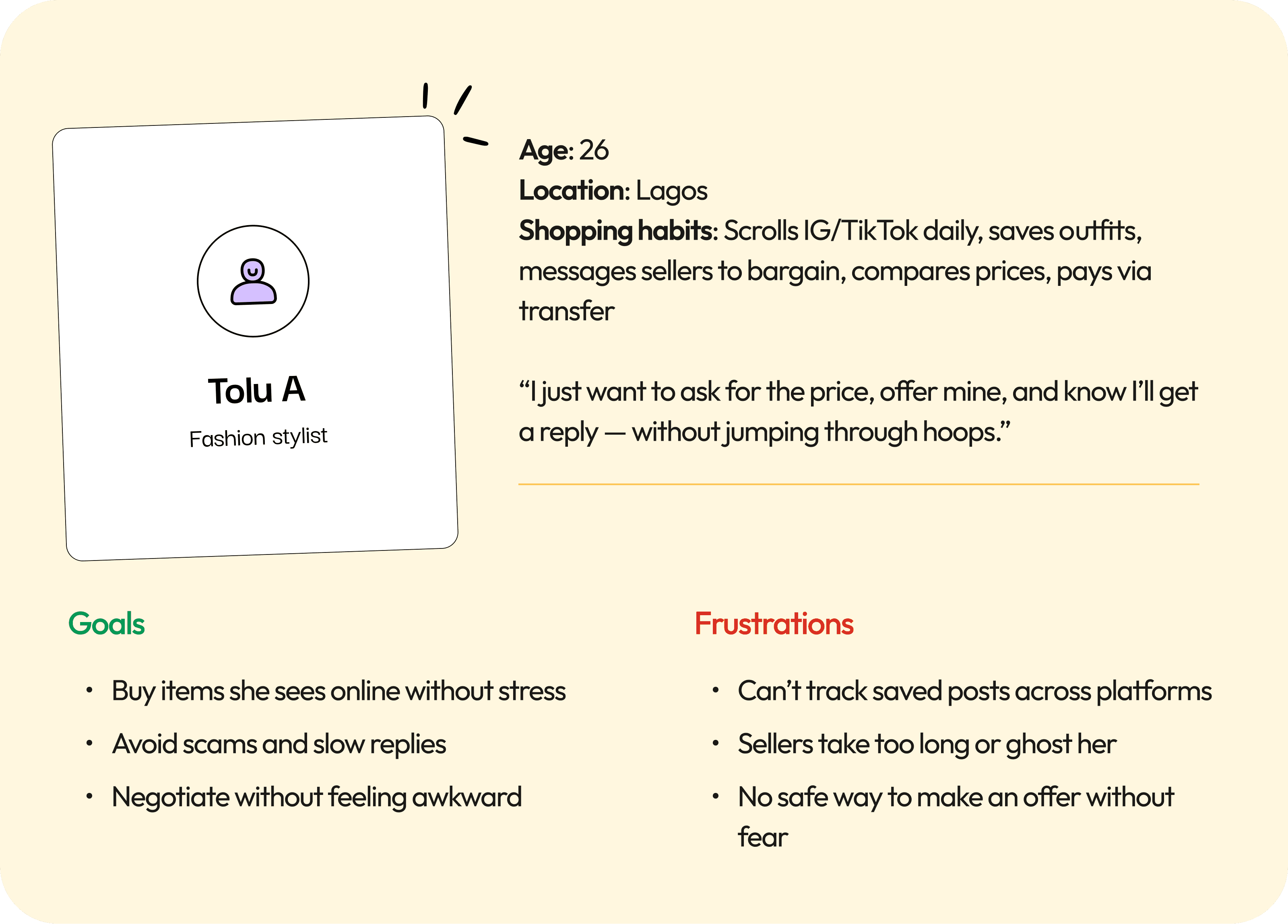
Persona
Empathy Map
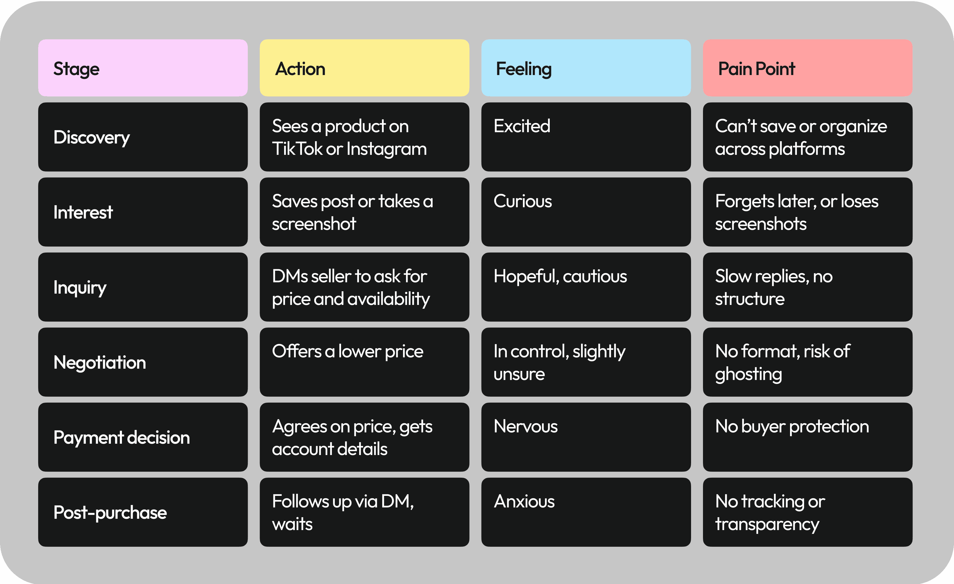
User Journey Map

Before I designed anything, I needed to understand how people really shop — not just what they say they do.
So instead of relying on assumptions or surface-level surveys, I spoke directly with users and asked them to tell me stories. To design for real behavior, I started by asking real questions.
Basic Info
What’s your full name?
What’s your email (optional — for follow-up)?
What age range do you fall into?
What’s your current profession?
Which region or city are you based in?
Discovery & Influence
Where do you usually discover new products — Instagram, TikTok, Facebook, search engines, or somewhere else?
When you see a product you like, what do you typically do next (e.g., save it, screenshot, message the seller)?
Are you more likely to buy a product if it’s recommended by a peer or influencer? Why?
Content & Confidence
Would user-generated video content (e.g., reviews, try-ons, tutorials) make you feel more confident in your buying decision?
What kind of content in a product video helps you decide whether it’s worth buying (e.g., close-ups, real use, comparison)?
Shopping Behavior
On average, how often do you shop online in a month?
What platforms do you usually use for online shopping — and why those specifically?
What influences your decision to buy from one platform or seller over another?
Can you describe what your ideal online shopping experience would look like — from discovery to checkout?
What are the most common frustrations or challenges you face when shopping online?
Personalization & Social Behavior
How important is it to you that a shopping experience feels personalized — like seeing content that matches your style or interests?
On a scale of 1–10, how important are social engagement features (likes, comments, reviews, seller ratings) when deciding whether to buy?
These weren’t checkbox interviews. They were conversations. My goal was to listen for the feelings behind the friction.
From those interviews, five core themes emerged:
1
Discovery happens socially.
Almost everyone found new products while scrolling — not searching. Instagram and TikTok were the starting points, not marketplaces.
2
People want to bargain — not just pay.
Fixed prices felt rigid. Users said they enjoyed “pricing it small,” and felt more committed when they negotiated.
3
Trust is everything — and fragile.
Most had been ghosted by a seller before. Many screenshot conversations just in case. Others backed out completely when a seller delayed or felt “off.”
4
They’re doing too much work just to buy one thing.
Switching between apps, managing screenshots, chatting, waiting… the whole process felt scattered and exhausting.
5
If an app doesn't feel useful after the first order — it's deleted.
Memory is tied to emotional relevance. No connection = no reason to return.
Those patterns came together in a single, clear persona:
EMPATHY SNAPSHOT
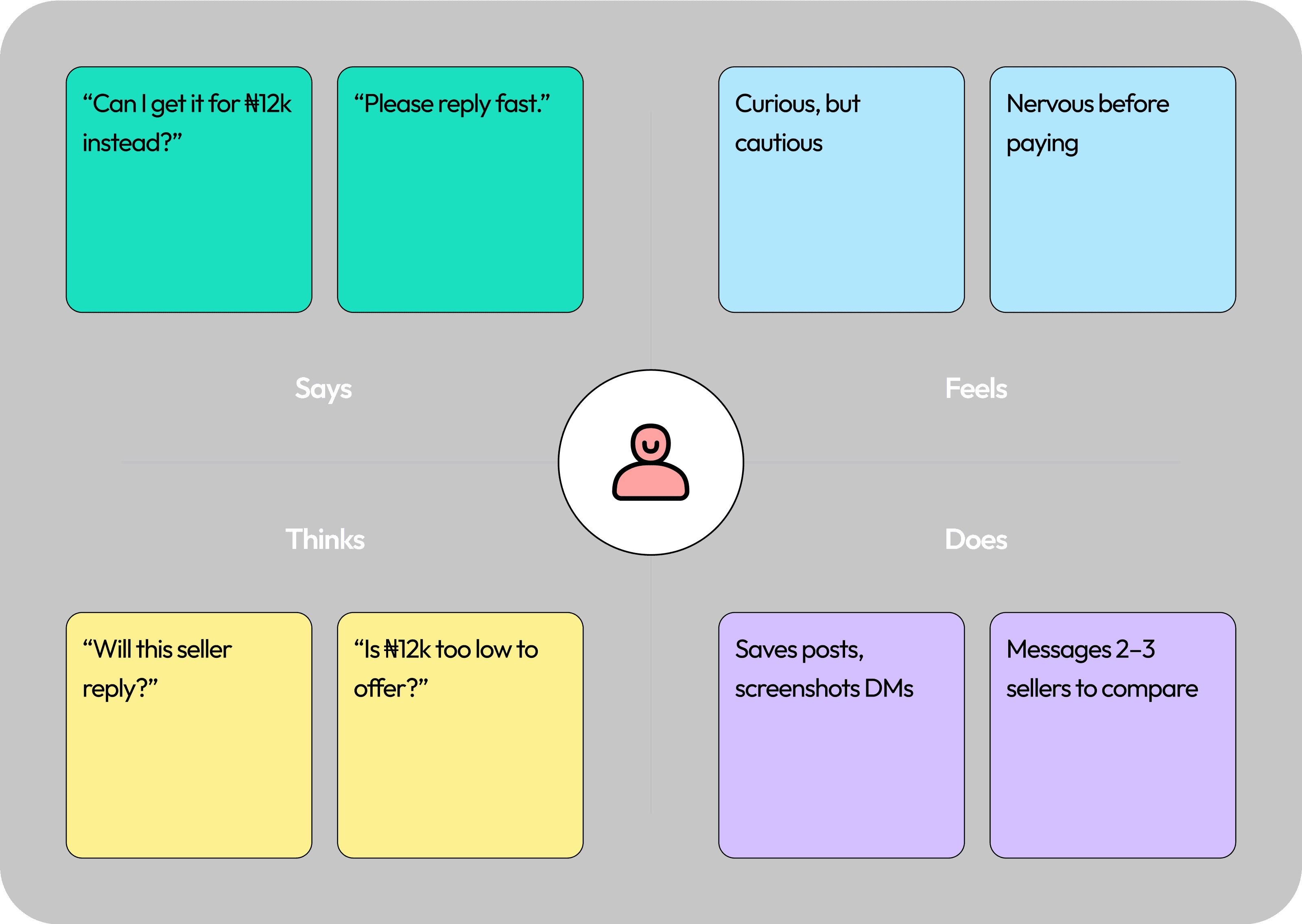
This journey map was built directly from how users described their real process
Stage 2
CONCEPTUALIZE
Insights
opportunity areas
How Might We

Once the user research was complete, I had a clear picture of what wasn't working — but more importantly, I saw what could work.
Instead of guessing at features, I translated the insights into strategic opportunity areas, then turned those into design questions that could guide the product direction.
I grouped my insights into four key opportunity themes
1
App Forgettability
“I used it once and never opened it again.”
Users didn’t see long-term value in most shopping apps. Once they completed a purchase, there was no reason to come back.
Opportunity:
Make the app naturally memorable without relying on push notifications or promotions
2
Bargaining Culture
“I always offer less. It’s part of shopping.”
Users want to feel like they got a deal — it’s a key part of Nigerian shopping culture. Most apps ignore this entirely.
Opportunity:
Make digital bargaining easy, natural, and fast.
3
Trust Gaps
“I’m scared they’ll take the money and disappear.”
Trust isn’t just about having a secure payment system. It’s about fast replies, transparency, and clear interactions.
Opportunity:
Design mechanisms that build trust before, during, and after the transaction.
4
Scattered Discovery
“I keep switching between Instagram, TikTok, and WhatsApp.”
Users find products socially, but lose track of them across platforms. The discovery experience feels fragmented and tiring.
Opportunity:
Unify product discovery across social platforms and make saving, revisiting, and buying feel seamless.
Each insight became a “How Might We” question — to keep the focus user-centered and open to multiple creative solutions.
HMW make the app memorable without needing to shout?
HMW bring bargaining into the digital experience — in a way that feels intuitive and fast?
HMW rebuild trust between buyers and sellers, especially when users fear getting ghosted or scammed?
HMW turn scattered social discovery into one streamlined, shoppable experience?
These questions became the backbone of my design decisions.
Stage 3
Design
Insights
opportunity areas
How Might We

Now that I had a clear understanding of the gaps — forgettability, trust, scattered discovery, and the need for bargaining — I began designing features that felt natural, not forced.
My goal was simple:
Don't teach users new behavior. Support what they're already doing — just better.
Feature 1
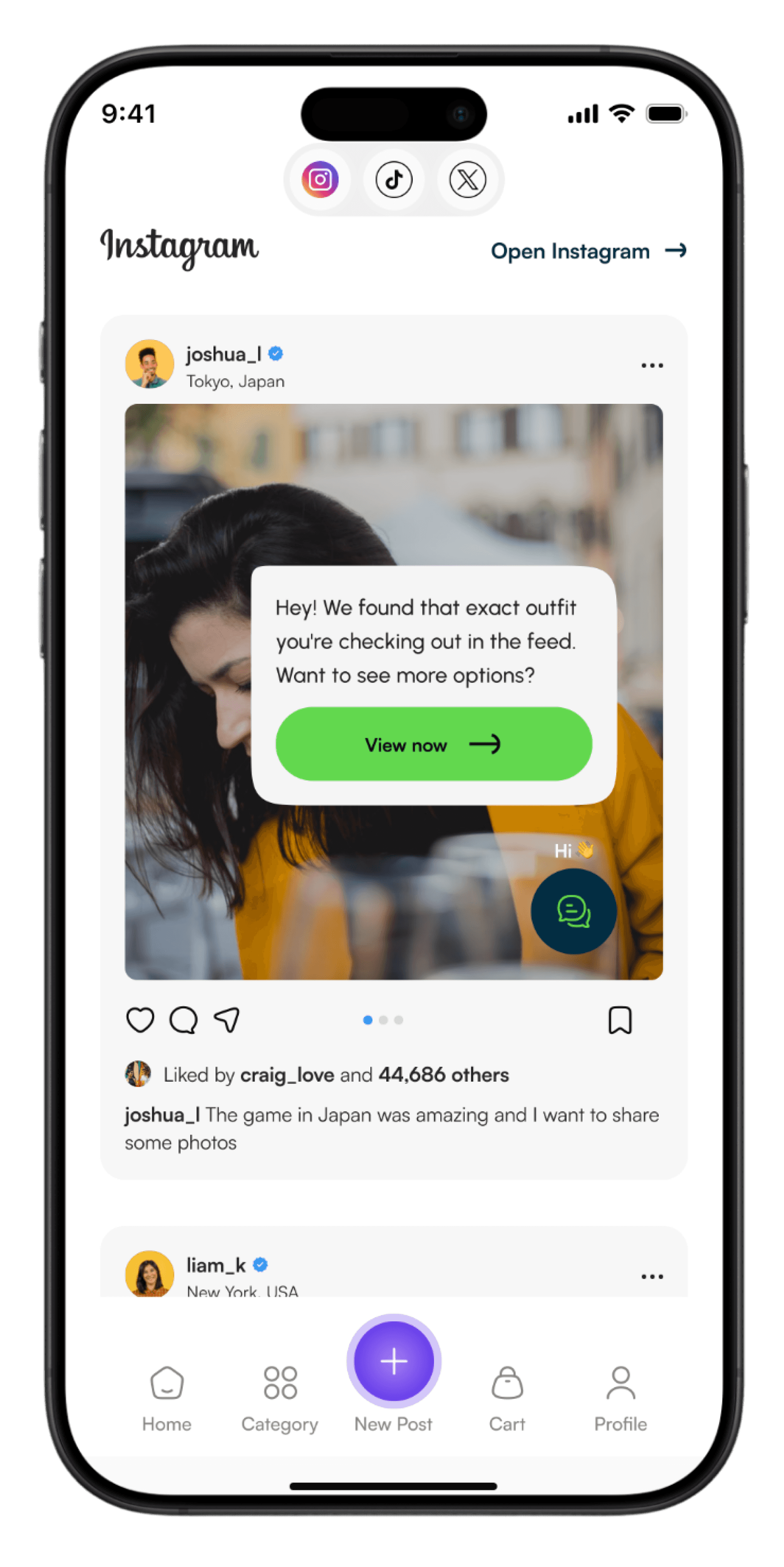
AI-Powered Curator
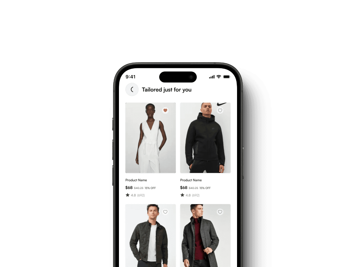
The AI Curator pulls in product content from platforms like TikTok and Instagram — based on what users view, save, and interact with. It learns their style, budget, and preferred product categories, then recommends items in a vertically scrollable, social-style feed.
Insight it solves: Scattered discovery + forgettable apps
Design goal: Turn everyday social browsing into a personalized shopping experience
Why it works:
Feels like TikTok/Instagram, not a traditional marketplace
Makes discovery feel fun and effortless
Reduces friction — no more lost screenshots or switching between apps
Builds habit through content, not reminders
“If users already trust TikTok to show them fashion inspo, why not let the app be a smart extension of that behavior?”
This screen showcases how the AI Curator turns passive scrolling into personalized product discovery, with each element tailored to user behavior.
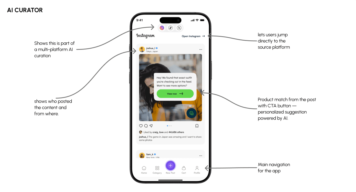
Here’s how the Curator delivers a social-style feed that feels familiar but is powered by intelligent recommendations.
Feature 2
AI-Powered Haggle
Instead of messaging sellers manually, users can input their offer (e.g. ₦12,000). The seller’s profile — powered by AI rules — can auto-accept, counter, or provide bundle deals. The entire negotiation happens quickly, clearly, and with options.
Insight it solves: Bargaining culture + trust gaps
Design goal: Let users negotiate digitally — without losing speed or structure
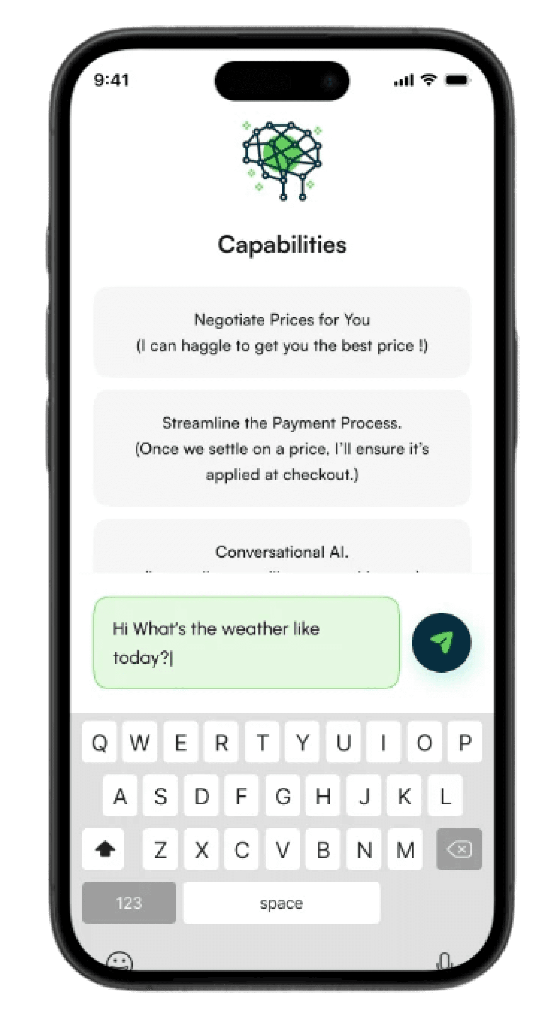
Why it works:
Mirrors how real people shop in Nigeria: “pricing” is expected
Adds structure: no more ghosting or awkward DM haggles
Keeps things quick — no long chats or waiting hours for a response
Makes users feel in control and respected
“People don’t want to be told a price. They want to negotiate their way into a good one.”
This screen showcases how the AI Curator turns passive scrolling into personalized product discovery, with each element tailored to user behavior.
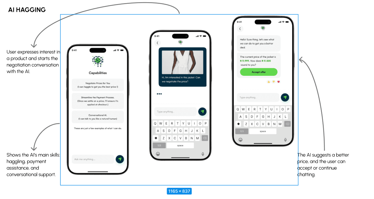
This flow shows how a buyer makes an offer and receives a counter — capturing the feel of real-life negotiation in just a few taps.
Feature 3
AI Social Post Generator
Sellers can input basic info about a product (name, price, style, usage, etc.), and the AI generates a ready-to-post video or carousel — including captions, hashtags, and product tags. Content feels native to TikTok or Instagram.
Insight it solves: Discovery + growth from sellers' side
Design goal: Help small sellers show up on social media without needing marketing skills
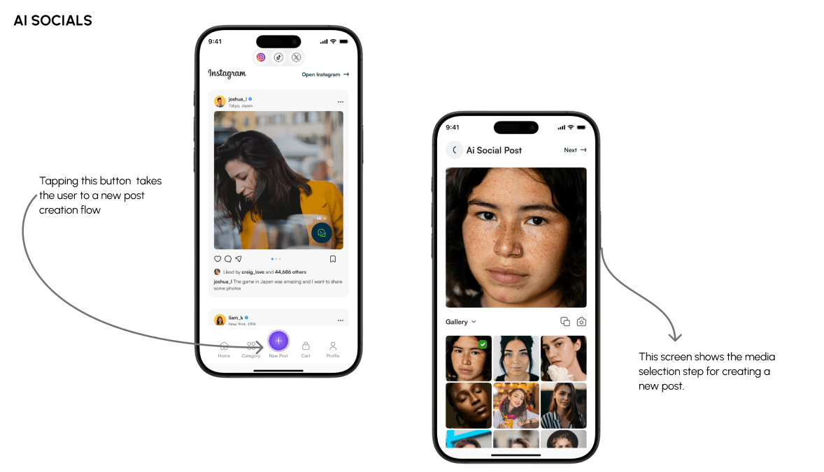
Why it works:
Boosts seller visibility — more content = more reach
Creates content that drives organic discovery
Saves time and effort for small business owners
Makes buyers feel like they’re browsing, not being sold to
“If the seller’s content is beautiful and native, discovery becomes seamless — and trust goes up.”
This screen illustrates how sellers can quickly generate polished, platform-native content — with each UI element simplifying the creation process.
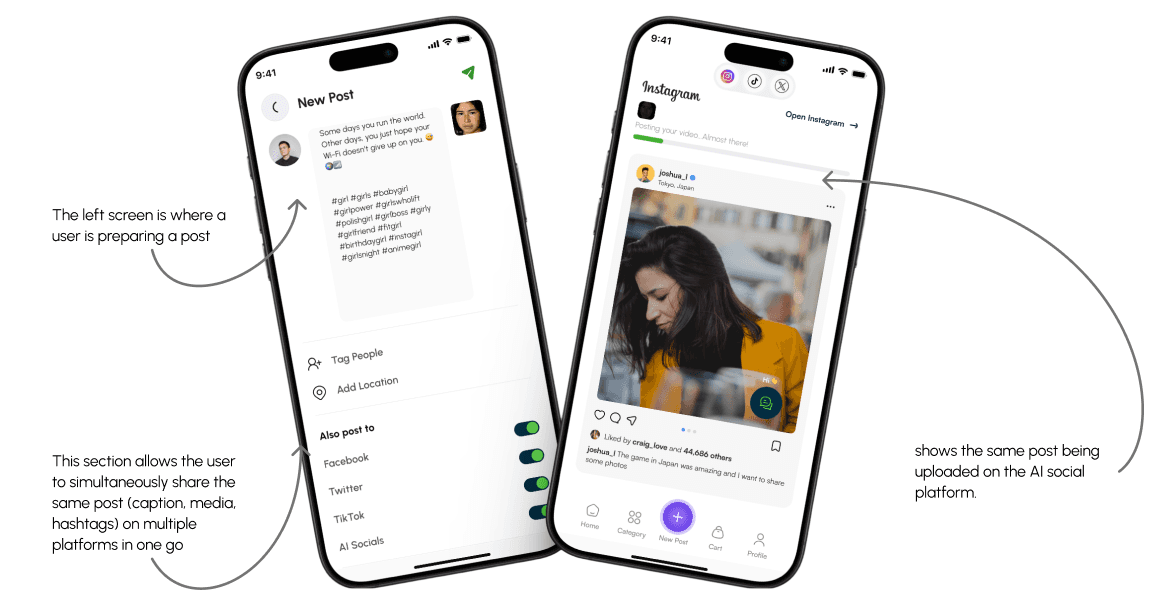
Watch how the AI transforms a simple product input into a ready-to-share post, helping sellers boost visibility with zero effort.
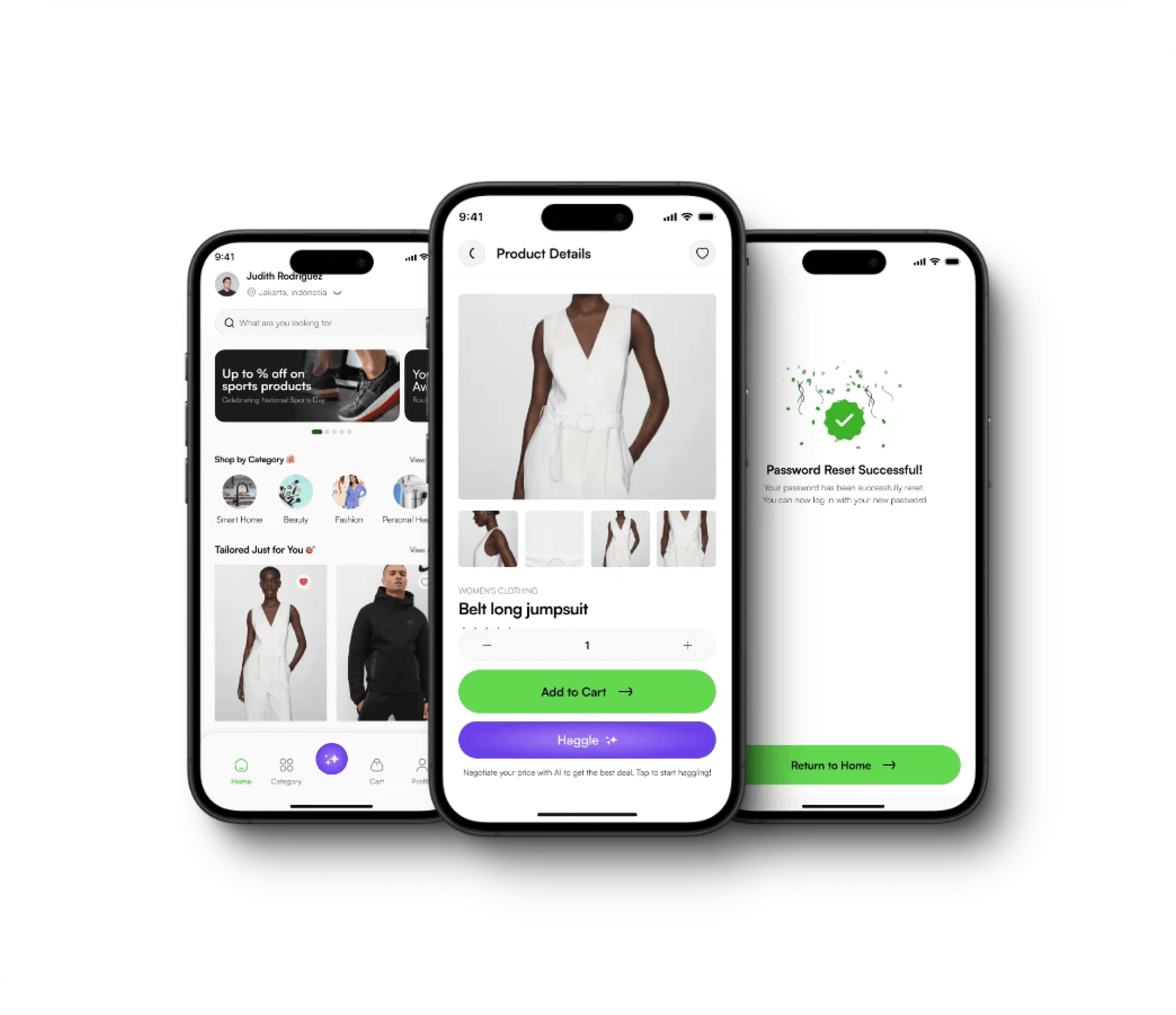
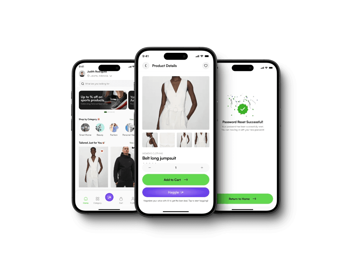
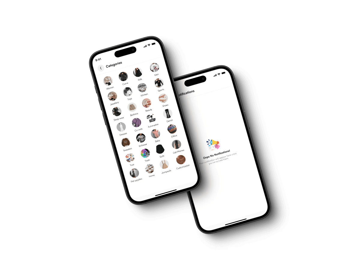
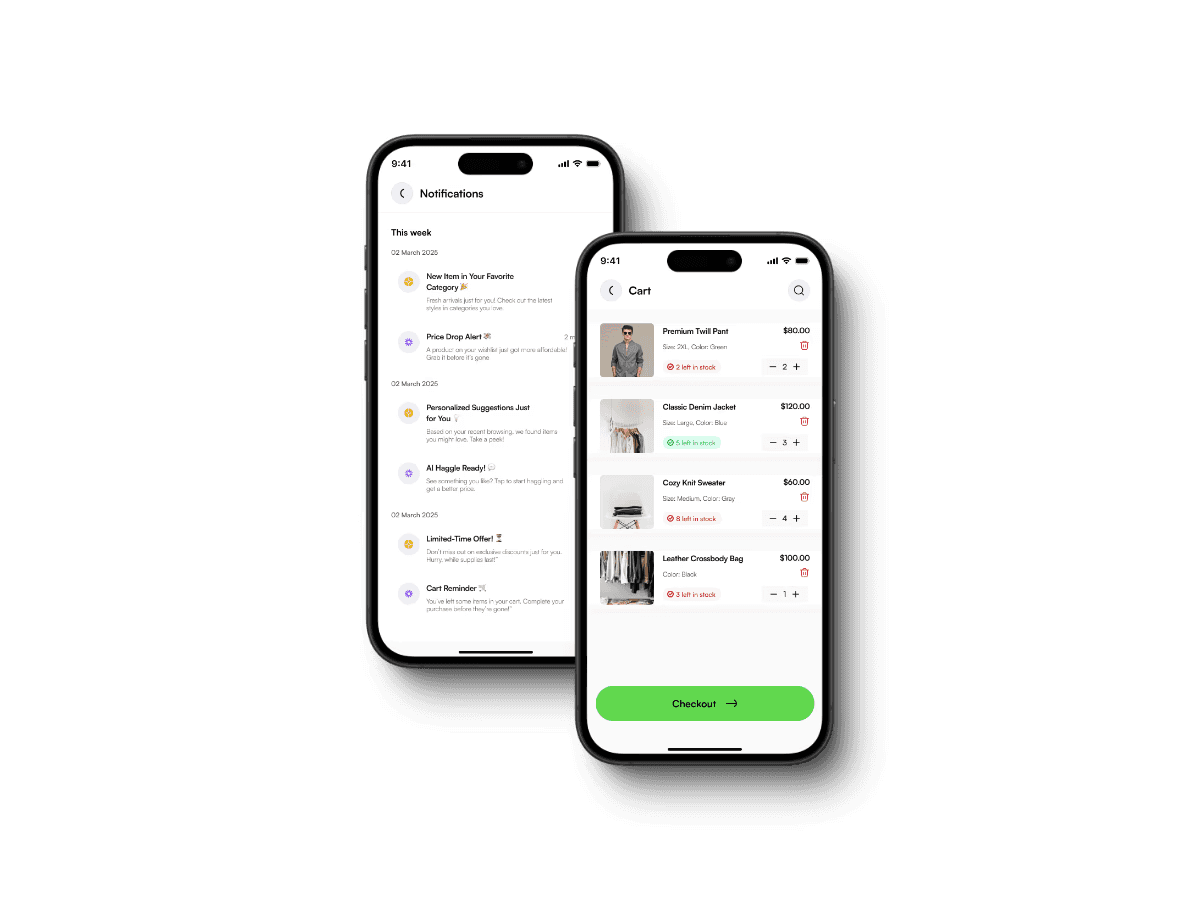
Essential Screens That Tie It All Together
Impact
Designing for real behavior — not assumptions — changed everything.
Instead of chasing trends, I focused on trust, cultural nuance, and shopping as a social, emotional experience. Every decision, from AI-powered curation to haggling to seller content, was rooted in how people already shop and what they truly need to feel in control.
Here’s what that unlocked:
Stronger retention — The experience was designed to feel useful after the first order, not disposable.
Higher trust — Structured chats, faster replies, and visible seller activity helped reduce ghosting and anxiety.
Natural engagement — Familiar interactions like scrolling, liking, and bargaining made the app feel like second nature.
Lesson Learned
This project reminded me: good design isn’t loud. It’s what makes people stay, come back, and feel seen.
Next Case Study
Loved that social shopping energy?
Now let’s shift from late-night scrolling… to actually getting out of bed on time.
In this next case study, I explore how smart design (and a little psychology) can help users wake up on time, feel good, and stick to a morning routine — even on their laziest days